
The goal with this rebrand was to modernize and simplify the existing branding. The cow head logo mark, the colors, and typography were all specifically chosen to be highly legible, gender natural, as well as inviting and easily recognizable across as many demographics as possible.
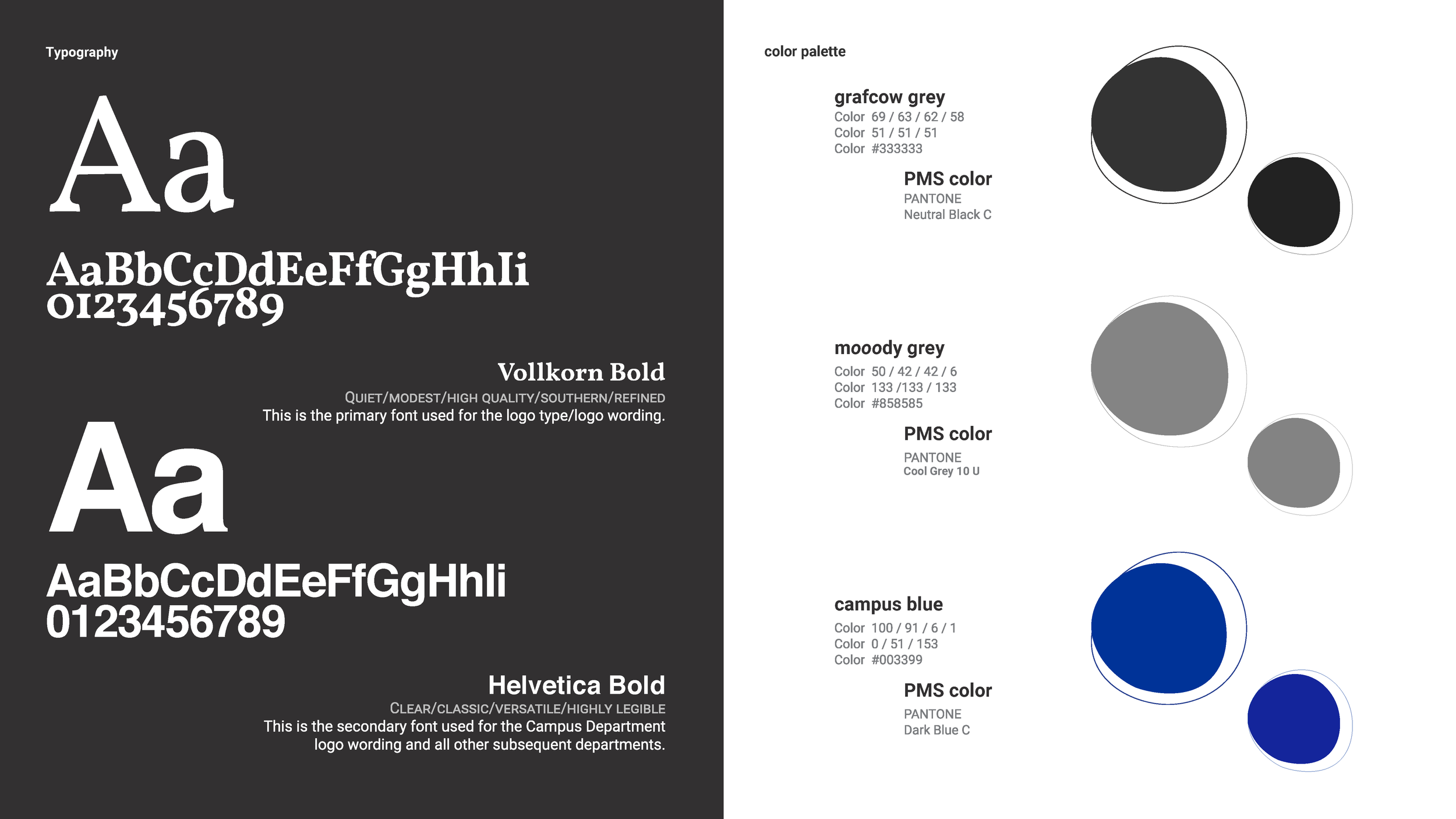
The Vollkorn typeface was chosen to bring an understated, refined southern feel to the brand to stay true to it's roots. Helvetica was chosen as the secondary font for a classic, comforting, highly legible and accessible feel. The colors were chosen based on existing brand colors. However they were refined to compliment each other well and be compatible across web and print design.
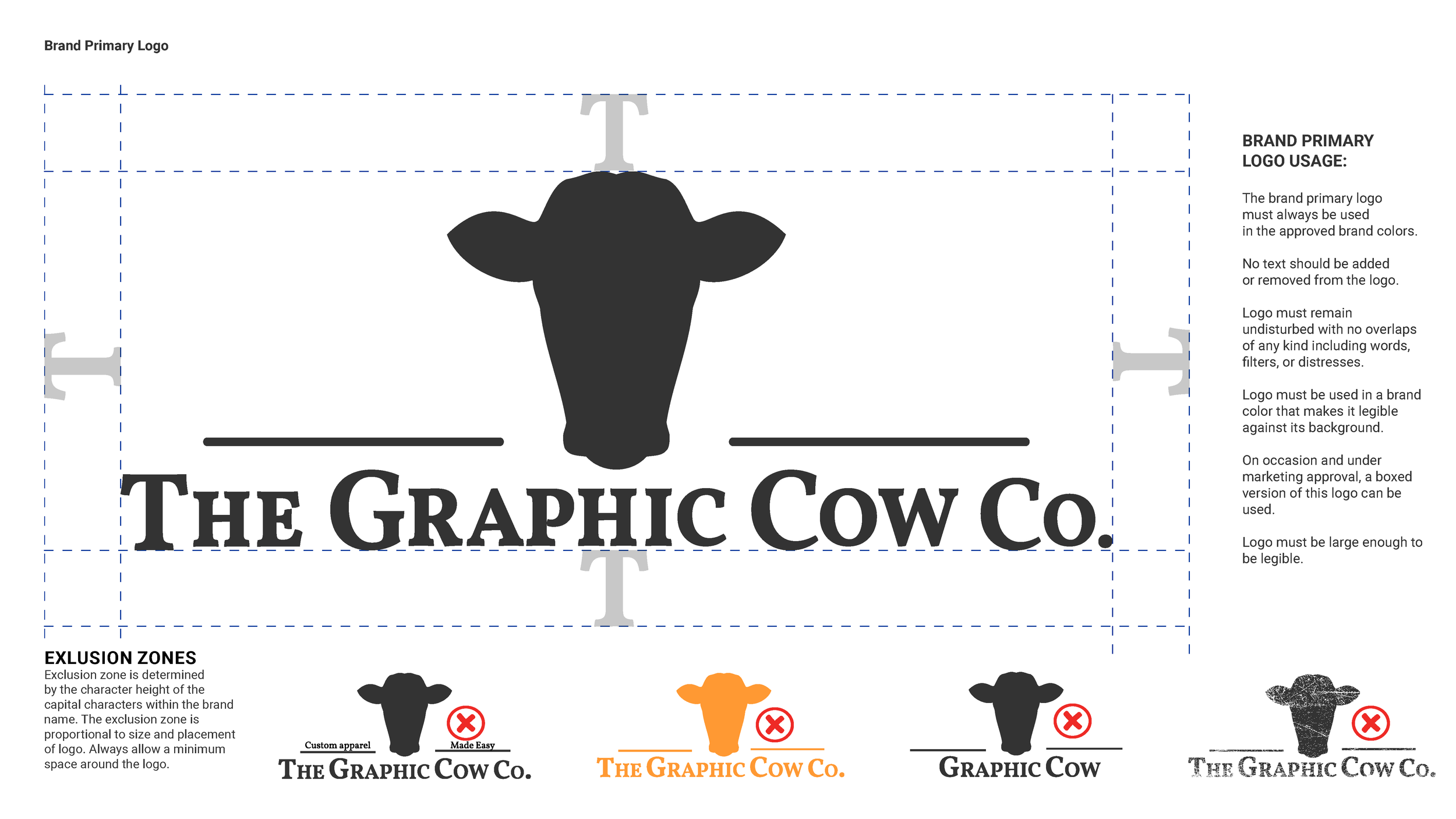
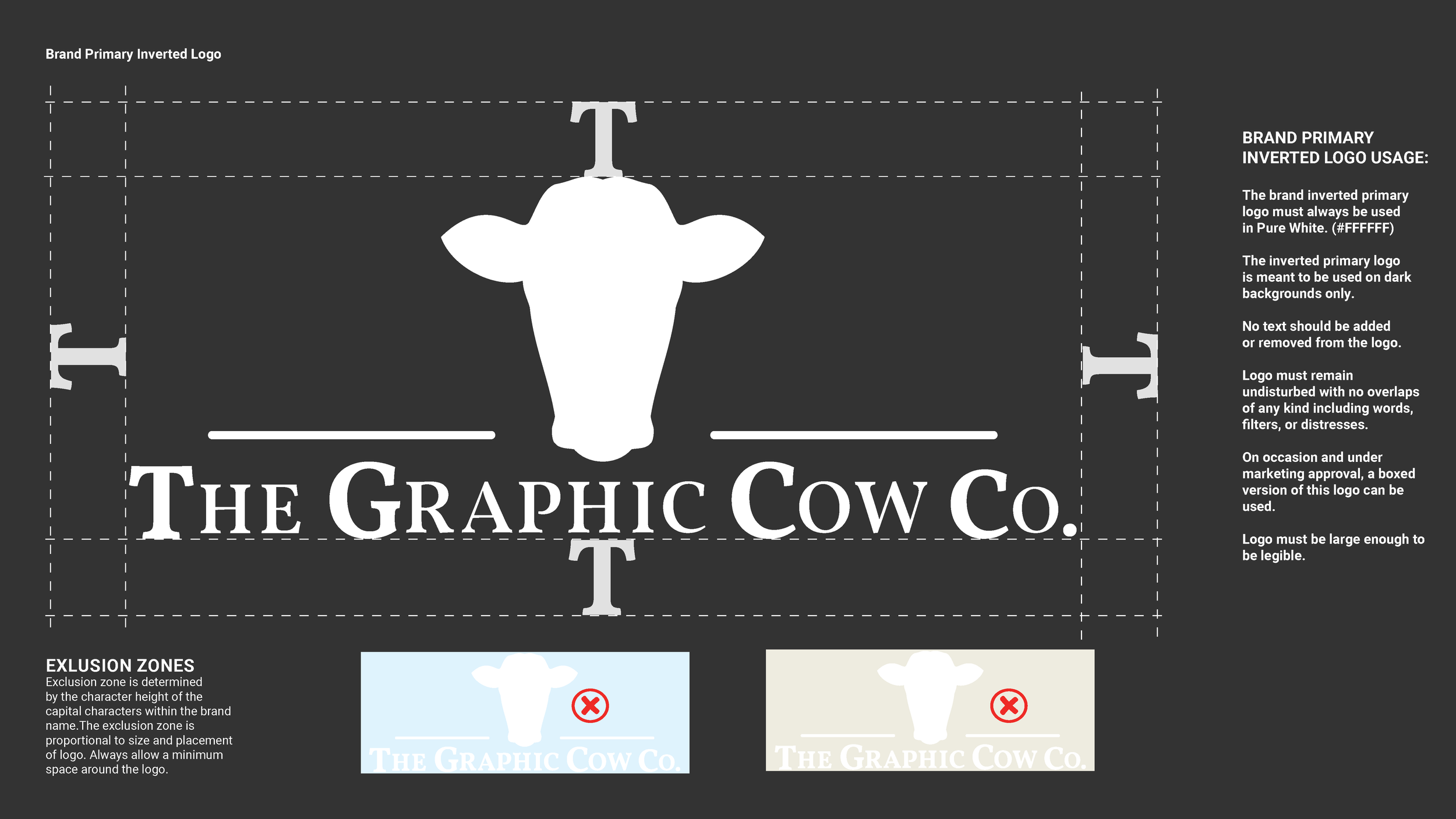
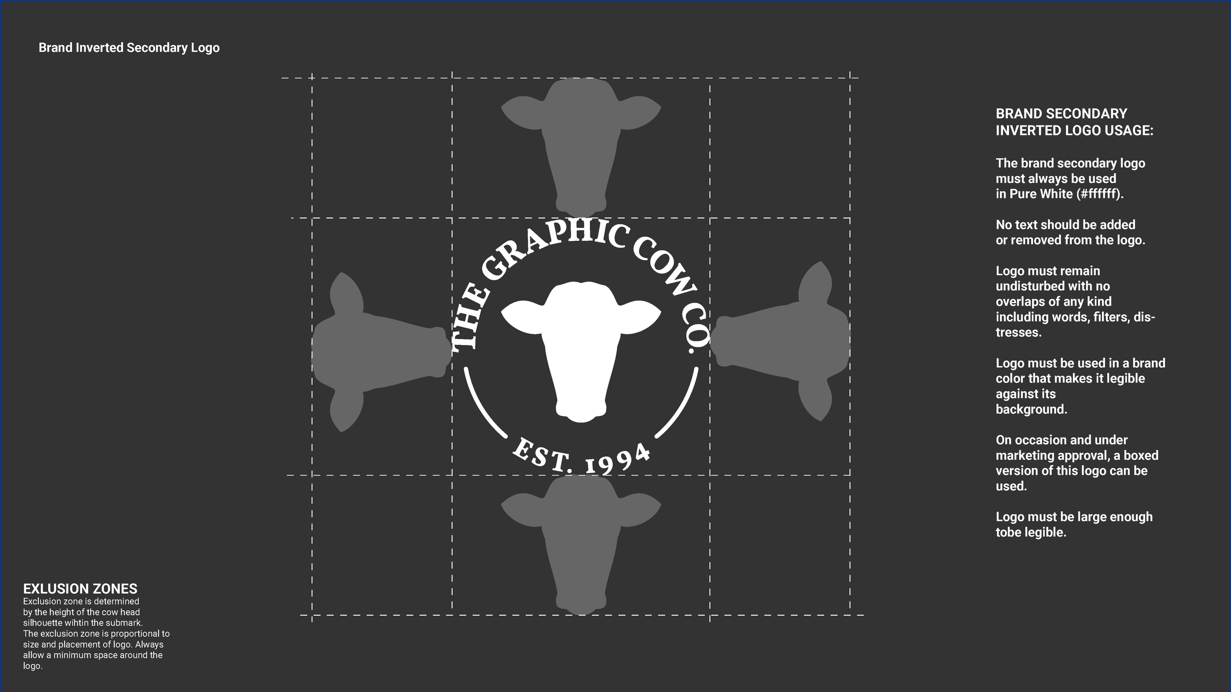
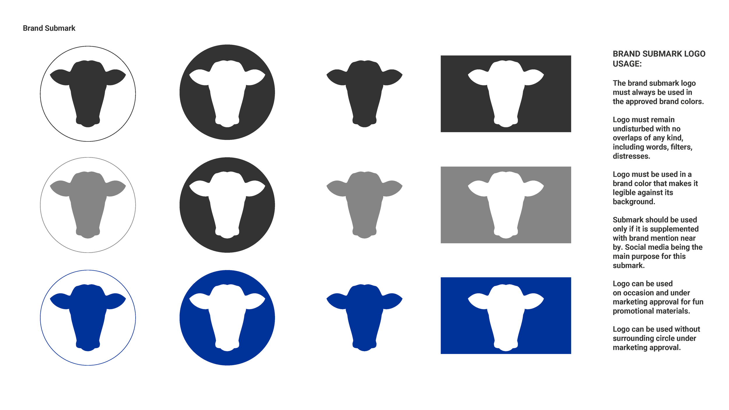
Various submarks were versioned out with the primary intended use case being social media profile images.
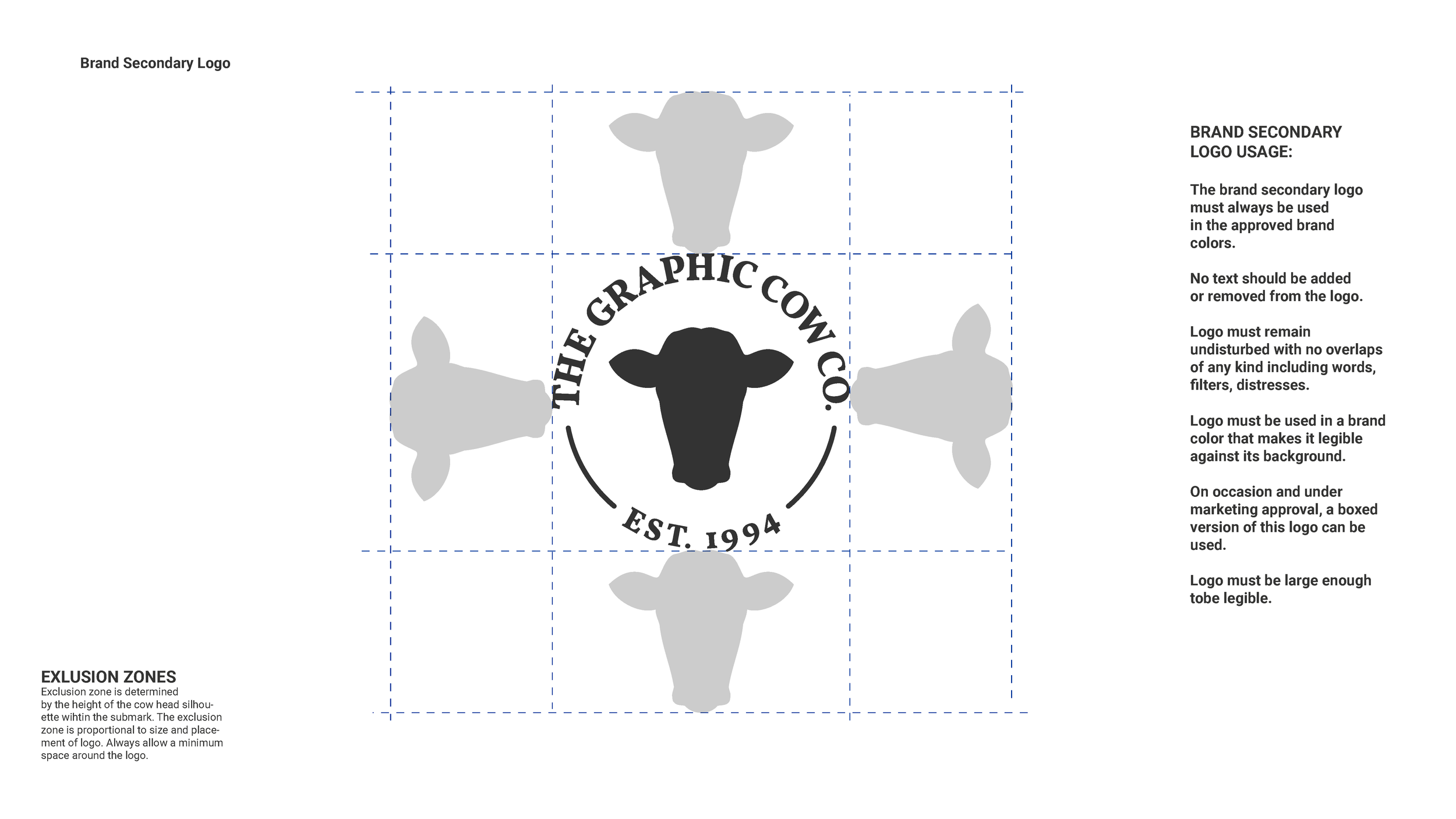
The secondary logo was designed to be a simple iteration of the primary logo for use cases that require a more compact logo.
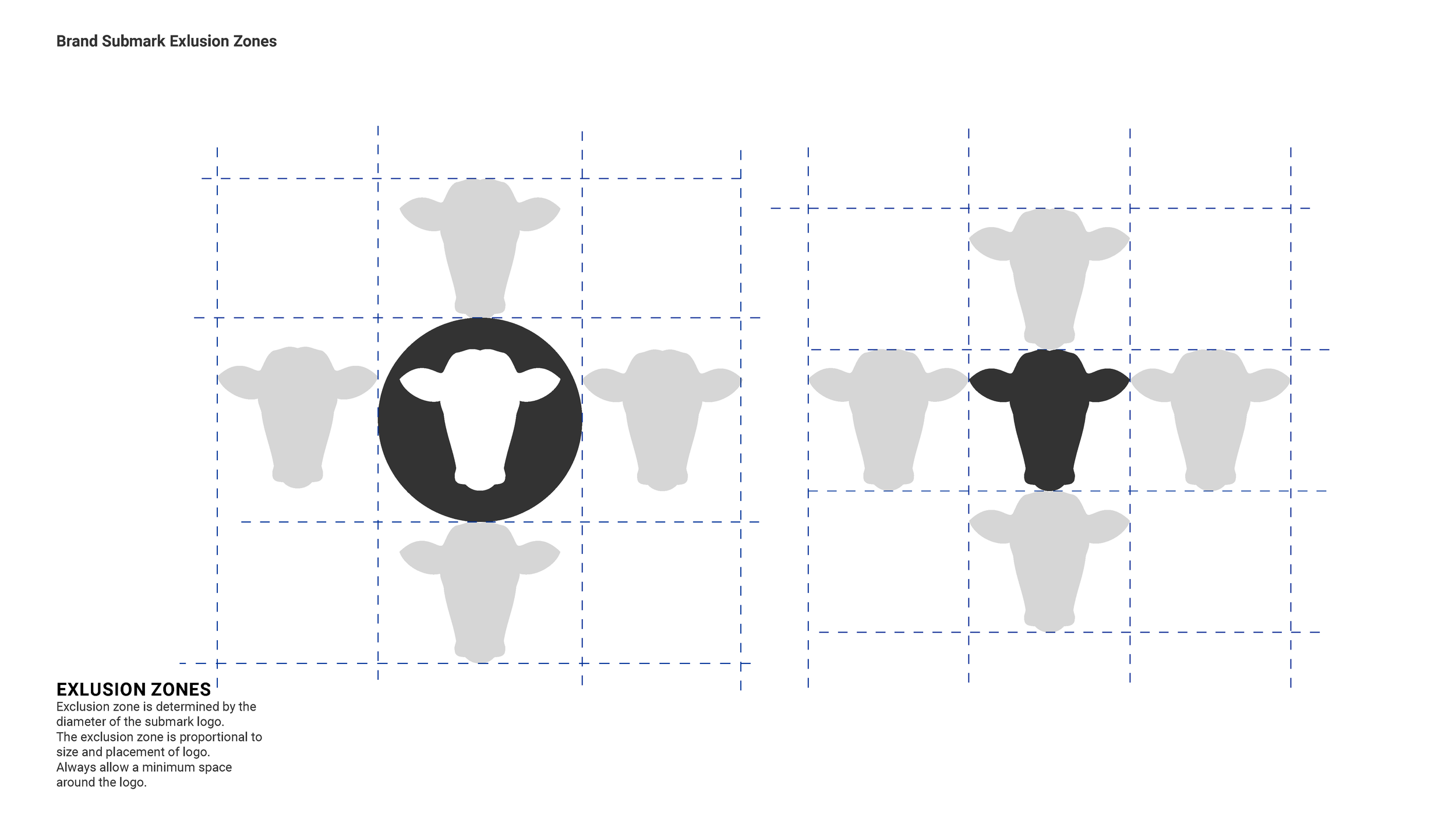
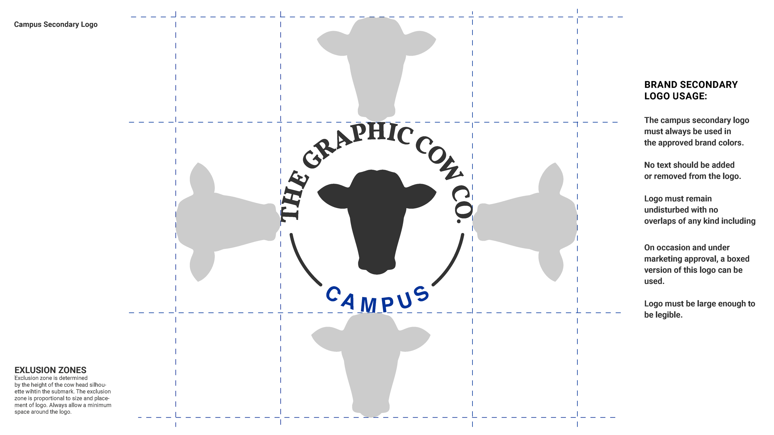
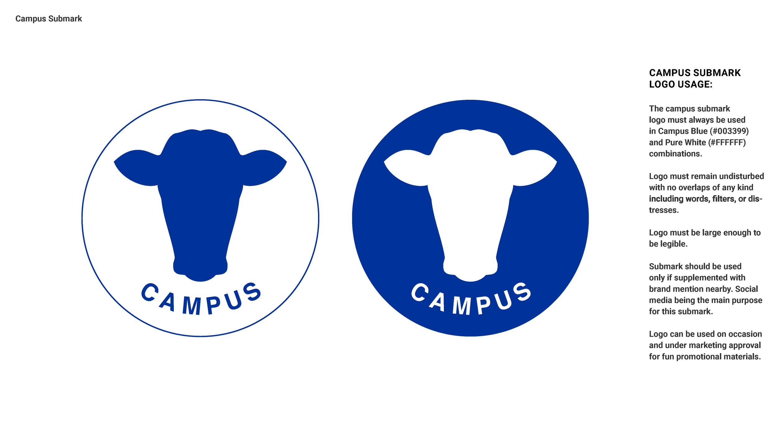
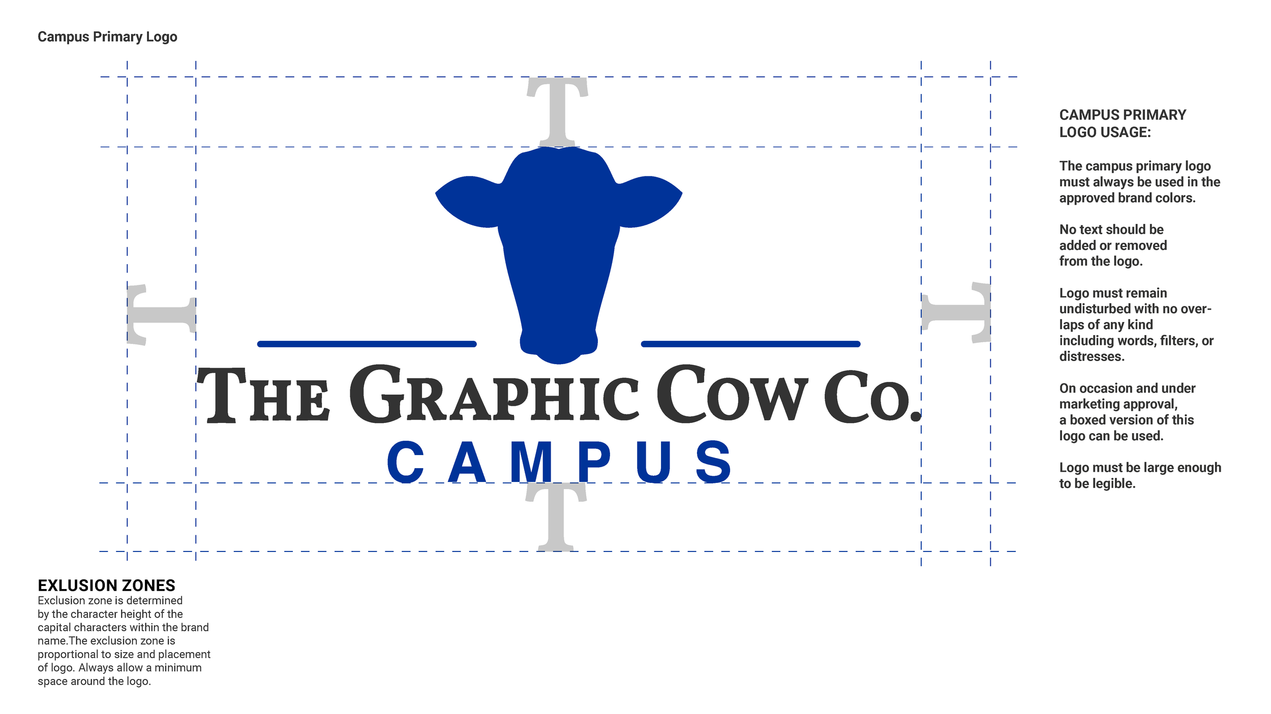
This logo variation was designed for a separate department dedicated to serving fraternities, sororities, and college campuses.
This rebrand was designed to be timeless, without the need to rebrand or make changes in the near future so as to build strong brand recognition with customers.